Brand Essence
"Micro Moments That Ripple Reality"
Of Course is about the quiet power of small, intentional shifts. It's the gentle knowing that alignment isn't a destination—it's found in the everyday moments we choose to notice, honor, and trust.
Primary Logo

OC monogram with small caps • Use for merchandise, website, and all brand touchpoints
Color Palette
Cream
#FAF8F5
Soft Taupe
#C4B7A6
Gentle Sage
#B8C4B8
Blush
#E8D5D5
Charcoal
#2C2C2C
Use Cream as primary background. Charcoal for text. Taupe, Sage, and Blush as soft accents.
Typography
LOGO & HEADLINES
of course
Elegant serif • Always lowercase • Light weight
BODY TEXT
Clean sans-serif for readability. Keep it light and airy with generous line spacing.
Inter, Nunito Sans, or similar • Regular weight
Visual Mood

Natural light • Organic textures • Calm, intentional moments • Soft focus • Breathing room
Voice & Tone
WE ARE
- • Gentle but grounded
- • Warm and inviting
- • Quietly confident
- • Thoughtful
- • Real, not preachy
WE'RE NOT
- • Loud or urgent
- • Overly mystical
- • Generic self-help
- • Complicated
- • Performative
EXAMPLE PHRASES
"Small shifts. Big ripples."
"Trust the quiet knowing."
"This is your of course moment."
Logo Usage
of course
On light backgrounds
of course
On dark backgrounds
- ✓ Always lowercase
- ✓ Give plenty of breathing room
- ✓ Keep it simple—no tagline required
Two Expressions, One Concept
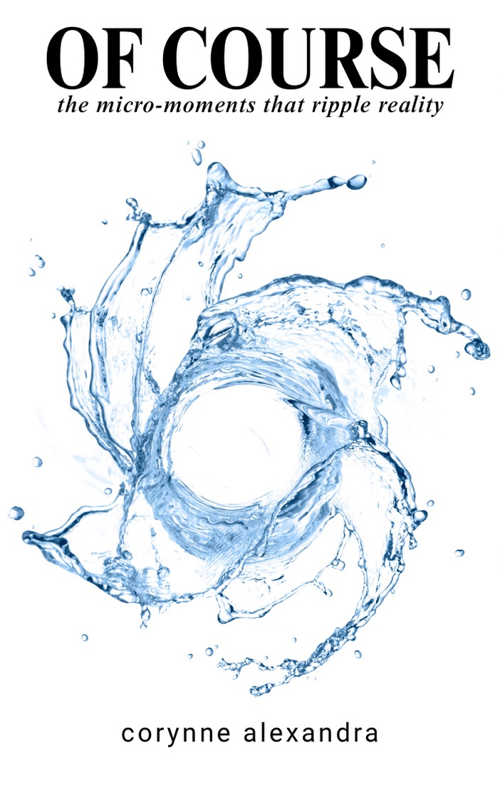
The Book
Bold, attention-grabbing, cool blue water imagery. The "splash" that draws people in.
of course
The Brand
Warm, grounded, soft tones. The calm space where readers integrate and grow.
Connected by the ripple concept, not identical colors. The book is the moment of impact; the brand is the expanding wave.